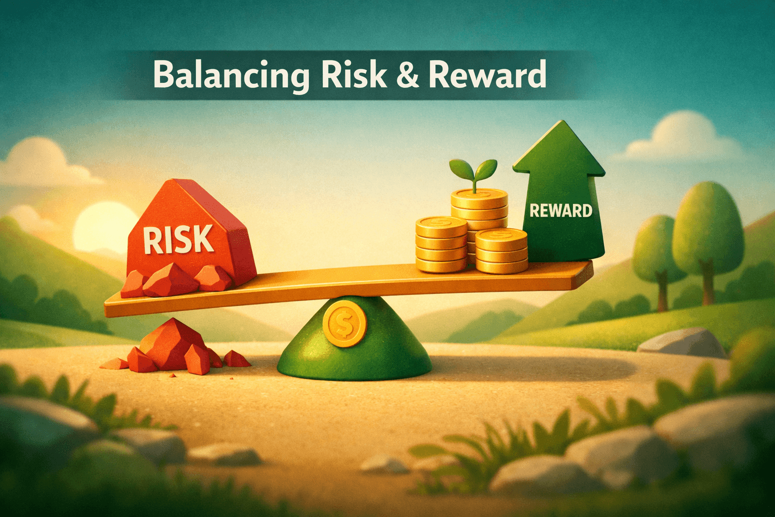
- Visualization turns raw holdings and transactions into quick, actionable insights, spot allocation drift, concentration, and performance at a glance.
- Use a mix of static charts (allocation, performance) and interactive dashboards (time filters, drill-down) for different decisions.
- Key metrics to track: asset allocation, time-weighted and money-weighted returns, drawdowns, volatility, and correlation.
- Build dashboards that match your goals: income, growth, tax optimization, or risk control, use alerts for drift and rebalancing triggers.
- Avoid common mistakes: overfitting charts, confusing nominal vs. risk-adjusted returns, and ignoring transaction timing.
Introduction
Portfolio visualization tools are software features and dashboards that convert holdings, transactions, and market data into charts and interactive displays. These tools help investors monitor asset allocation, returns, and risk metrics visually rather than by combing through spreadsheets.
For investors, visualization reduces cognitive load and speeds decision-making: a pie chart reveals allocation drift, a heatmap shows sector concentration, and an interactive time-series plot highlights drawdowns. This matters because good monitoring lowers the chance of unintended bets and helps you align the portfolio with your goals.
In this article you'll learn what visualizations matter, how to set up effective dashboards, how to interpret key metrics and risk visualizations, and practical examples using real tickers and numbers. You'll also get common pitfalls and an FAQ to sharpen your monitoring workflow.
Why Monitoring Matters
Monitoring is the continuous process of checking whether your portfolio matches objectives like target allocation, risk tolerance, and income needs. Without it, a winning stock or sector can grow to dominate your portfolio unintentionally.
Studies show that asset allocation explains more than 90% of long-term portfolio returns variance across diversified portfolios, making visualizing allocation and rebalancing crucial for outcomes. Visual tools make it easier to see when allocations drift and when rebalancing is needed.
Types of Portfolio Visualizations and What They Reveal
Different charts emphasize different insights. A good dashboard combines multiple views so you can go from high-level checks to detailed attribution analysis.
Allocation Charts
Pie or stacked bar charts show the current split across asset classes, sectors, or geographic regions. They answer: are you overweight equities? Is your fixed income allocation still at target?
Example: a 60/40 target portfolio should show roughly 60% equities and 40% bonds. If a pie chart shows 72% equities after a rally, that's a visual cue to rebalance.
Performance Over Time
Line charts display portfolio value or cumulative return over time. Add benchmarks (e.g., $VTI for U.S. total market) to see relative performance. Include time filters (1M, 6M, 1Y, since inception) for context.
Interactive features, hover to see daily values, zoom to a specific window, help identify when gains or losses occurred and link them to events or trades.
Risk and Volatility Visuals
Drawdown charts plot peak-to-trough declines and show recovery periods. Volatility can be displayed as rolling standard deviation or annualized volatility bands around returns.
Correlation matrices and heatmaps reveal which holdings move together, critical for diversification. For example, a high correlation between $AAPL and $MSFT reduces diversification benefit in a tech-heavy portfolio.
Attribution and Contribution
Bar charts that break down return contribution by holding or sector help you see drivers of performance. Attribution visuals separate market (beta) effects from security selection (alpha).
Example: If $TSLA contributed +4% to your portfolio's 8% return while $BND detracted -0.5%, attribution clarifies where gains came from.
Setting Up an Effective Dashboard
Design dashboards around decisions you must make. Are you rebalancing quarterly? Monitoring income? Managing tax lots? Each objective suggests a different set of widgets.
Essential Widgets to Include
- Allocation pie/stacked bar (by asset class, sector, region)
- Portfolio value and cumulative return time-series with benchmark overlay
- Drawdown chart and rolling volatility plot
- Top contributors and detractors table or bar chart
- Correlation heatmap and concentration metrics (top 10 holdings %)
Practical Steps to Build It
- Aggregate holdings and transactions. Import via brokerage API, CSV, or manual entry. Ensure you have quantity, cost basis, and timestamps.
- Map tickers to asset classes and sectors. Use ETF/stock metadata so $VTI counts as equity and $BND as fixed income.
- Choose default timeframes: YTD, 1Y, 3Y, since inception. Provide custom date ranges for tax or performance queries.
- Set alerts: percent allocation drift, drawdown thresholds, or value changes that trigger review.
Interpreting Key Metrics and Visualizations
Visuals are only useful when you interpret them correctly. Focus on metrics that connect to your plan: absolute returns for goal progress, risk-adjusted returns for strategy assessment, and concentration for diversification.
Returns: Nominal, Time-Weighted, and Money-Weighted
Nominal returns show total percent change in value. Time-weighted return (TWR) neutralizes cash flows and is best for evaluating manager or strategy performance. Money-weighted return (IRR) reflects investor experience when you make contributions or withdrawals.
Use TWR charts to compare your portfolio to $VTI or $AGG, and use IRR when assessing your personal savings performance over a period with many cash flows.
Risk Metrics to Watch
- Drawdown: measures worst peak-to-trough loss, critical for understanding potential near-term loss.
- Volatility: rolling standard deviation provides a sense of return variability.
- Beta: sensitivity to a benchmark, higher beta means larger swings relative to the market.
- Correlation: impacts diversification, low correlation reduces portfolio volatility.
Using Visuals for Rebalancing Decisions
Visualize allocation against target bands (e.g., ±5%). If equity slips above 65% from a 60% target, the allocation chart and an alert can prompt a rebalance. Decide whether to rebalance by selling, buying other assets, or using new cash.
Combine allocation visuals with tax lot and transaction panels to choose tax-efficient moves, sell losers or use new contributions to rebalance into underweight asset classes.
Real-World Example: From Data to Decision
Example portfolio (start of year): $10,000 allocated as $AAPL 20% ($2,000), $VTI 40% ($4,000), $BND 40% ($4,000). Over 12 months, $AAPL returns +30%, $VTI +10%, $BND -1%.
- End values: $AAPL = $2,600; $VTI = $4,400; $BND = $3,960; Portfolio total = $10,960 (9.6% nominal return).
- Allocation drift: equities now $AAPL + $VTI = $7,000 = 63.9% vs. 60% target, visual allocation chart flags a 3.9pp drift.
- Attribution: $AAPL contributed +6% of portfolio return (increase of $600 on $10,000), $VTI +4% ($400), $BND -0.4% (-$40).
Actionable insight from the dashboard: equity overweight of ~4 percentage points. If your rebalance threshold is ±5pp, you may wait; if threshold is ±2pp, the dashboard suggests rebalancing by trimming equities or adding to bonds.
Adding a drawdown chart also helps: if the portfolio recently experienced a 12% drawdown and is now near a new high, you may choose to rebalance more conservatively to lock gains and maintain risk profile.
Common Mistakes to Avoid
- Over-relying on a single chart: A pie chart alone can hide timing and performance nuances. Combine allocation charts with time-based performance and attribution.
- Confusing nominal vs. risk-adjusted returns: A high nominal return may come with outsized volatility. Use Sharpe or rolling volatility visuals to see risk-adjusted performance.
- Ignoring cash flows in performance calculations: Using nominal returns without distinguishing TWR and IRR misrepresents manager performance when there are deposits/withdrawals.
- Excessive reactivity to short-term noise: Frequent small rebalances increase costs and taxes. Use thresholds and time-based rules enforced by dashboard alerts.
- Not validating data feeds: Missing or mismatched cost basis and dividends skew performance metrics. Periodically reconcile with brokerage statements.
FAQ
Q: How often should I review my portfolio visualizations?
A: Monthly checks are reasonable for most investors; quarterly reviews for formal rebalancing are common. More frequent monitoring may be useful during volatile markets, but avoid reacting to short-term noise.
Q: Which visualization is best for spotting concentration risk?
A: A top-holdings bar or pie chart combined with a concentration metric (top 10 holdings %) and a sector heatmap is best. Correlation matrices add depth by showing which holdings move together.
Q: Should I compare my portfolio to a single benchmark?
A: Use multiple benchmarks: a blended benchmark matching your target allocation for overall performance and single-asset benchmarks (e.g., $VTI, $AGG) for sub-asset performance. Blended benchmarks avoid misleading comparisons.
Q: Can visual tools replace detailed analysis like tax-lot selection or scenario stress tests?
A: Visual tools are powerful for high-level decisions but should complement detailed analyses. Use charts for discovery and dashboards, then run tax-lot, transaction-cost, and scenario simulations before executing trades.
Bottom Line
Portfolio visualization tools translate complex holdings and performance data into intuitive charts and dashboards that support faster, more informed decisions. Focus on allocation, returns (TWR and IRR), drawdowns, volatility, and correlation to maintain alignment with your goals.
Build dashboards that fit your decision workflow, validate inputs, and set clear rebalancing and alert rules. Use visuals to discover issues and follow up with detailed analysis before acting. Consistent monitoring using visualization tools reduces unintended risk and helps keep your portfolio on track.
Next steps: aggregate your holdings into one dashboard, pick 4, 6 core widgets from this article, and set one rebalancing rule and one alert to start turning visual insights into disciplined actions.