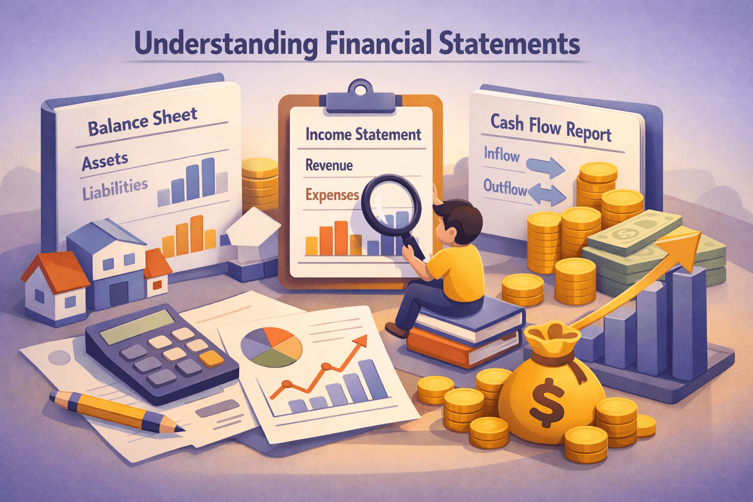
Key Takeaways
- Charts visualize price history, line, bar, and candlestick charts each show price differently.
- Trend direction (up, down, sideways) guides short-term bias; trends are identified by higher highs/lows or lower highs/lows.
- Support and resistance are price levels where buying or selling interest often appears; they help set entry and exit reference points.
- Simple moving averages smooth price action and highlight trend; use crossovers and slope to confirm direction.
- Combine multiple tools, price action, support/resistance, and one indicator, to avoid false signals.
- Avoid common mistakes like overtrading, ignoring timeframes, and relying on a single indicator.
Introduction
Technical analysis is the study of historical price and volume data to make decisions about possible future price movement. It uses charts and patterns to help investors and traders identify trends, entry points, and risk levels.
For individual investors, learning basic chart reading skills matters because charts condense complex information into visual cues you can act on. You don't need advanced math to get started, just a few concepts and practice.
This article covers the main chart types (line, bar, candlestick), how to identify trends, support and resistance, simple moving averages, and practical examples using real tickers. By the end you'll understand how to read charts and apply a simple framework when looking at stocks.
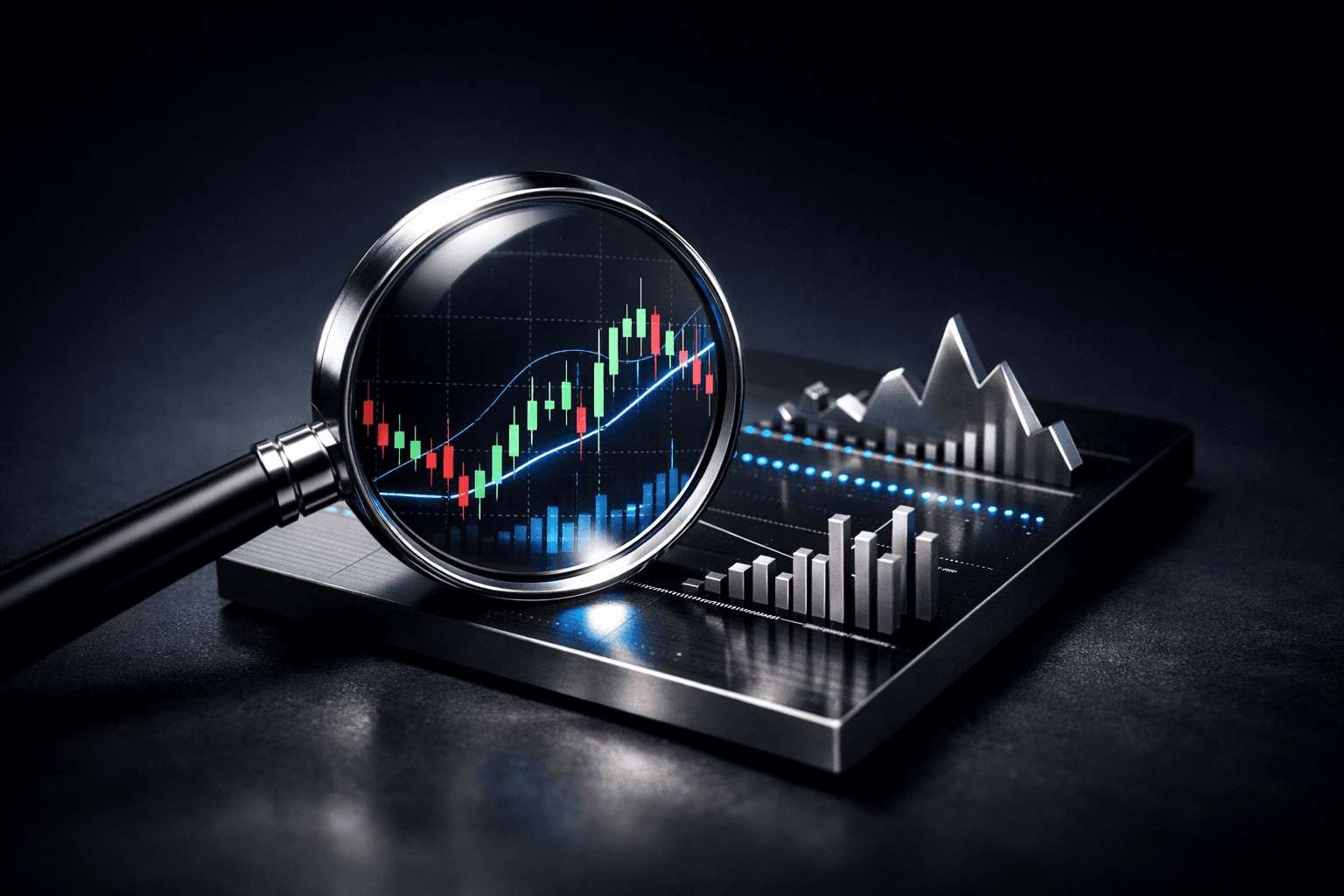
Chart Types: What Each One Shows
Charts are the foundation of technical analysis. Different chart types show the same price history but emphasize different information. Understanding each helps you pick the right view for your goals.
Line Charts
Line charts plot a single price point per time period, usually the closing price, and connect those points with a line. They are the simplest way to see the overall trend over days, weeks, or years.
Use line charts when you want a clean view of trend direction without noise. For example, a 5-year line chart of $MSFT shows the long-term trend without short-term volatility.
Bar Charts
Bar charts show open, high, low, and close (OHLC) for each period. Each vertical bar represents the price range; small dashes on the left and right indicate open and close.
Bar charts give more detail than line charts and help you spot intraday or daily price behavior. Traders use them to see where price spent most of the period and whether buyers or sellers dominated.
Candlestick Charts
Candlesticks also show OHLC but in a graphical box-and-line format that is easier to read visually. The “body” (box) shows open to close; thin lines (wicks or shadows) show the high and low.
Candlesticks are popular because common patterns (like doji, hammer, engulfing) can signal short-term shifts in momentum. A candlestick chart of $AAPL over a few months often reveals clearer reversal signals than a line chart.
Price Action and Trend Basics
Price action refers to the movement of price over time without relying on indicators. Trend is the primary concept: prices may be in an uptrend, downtrend, or sideways (range).
Identifying Trends
- Uptrend: series of higher highs and higher lows. Example: if $NVDA moves from $150 to $200, pulls back to $170, then rises to $220, the pattern shows higher highs/lows.
- Downtrend: series of lower highs and lower lows. Example: $TSLA falling from $250 to $180, rallies to $210, then drops to $160 shows a downtrend.
- Sideways: price oscillates between horizontal support and resistance with no clear higher highs or lower lows.
Timeframe matters: a stock can be in a short-term uptrend but a long-term downtrend. Always define your timeframe (intraday, daily, weekly) before drawing conclusions.
Trendlines and Channels
Draw trendlines by connecting two or more swing highs or lows. A valid trendline needs at least two points; the more points that respect it, the stronger it is.
Channels are parallel trendlines that contain price movement. They help set target and stop levels, price often bounces between channel boundaries until it breaks out.
Support and Resistance: Where Price Often Reacts
Support is a price level where demand tends to increase and stop falling; resistance is where supply tends to increase and stop rising. These are not exact numbers but zones where price frequently stalls or reverses.
How to Identify Support and Resistance
- Horizontal levels: mark recent swing highs and lows on a chart. If $AAPL repeatedly reverses near $150, that area becomes resistance or support depending on the direction.
- Round numbers: psychological levels like $50, $100 often act as magnets because traders cluster orders there.
- Previous support switches to resistance after a break (and vice versa). This flip helps confirm breakouts or breakdowns.
Volume often increases at support/resistance. A breakout above resistance with higher-than-average volume is more likely to sustain.
Practical Use of Support/Resistance
Set stop-loss orders just below support in an uptrend to limit risk. Use resistance to define potential take-profit areas. Always allow a margin because support/resistance are zones, not points.
Moving Averages and Simple Indicators
Moving averages smooth price data to highlight trend direction. They are among the most beginner-friendly indicators and work well with price action.
Simple Moving Average (SMA)
An SMA averages the closing prices for a set number of periods (e.g., 20-day SMA). A rising SMA indicates upward momentum; a falling SMA indicates downward momentum.
Common settings: 20-day (short-term), 50-day (intermediate), 200-day (long-term). For instance, many investors watch the 200-day SMA for long-term trend bias of $MSFT or $AAPL.
Using Moving Average Crossovers
- Bullish signal: short-term MA crosses above a longer-term MA (e.g., 50-day crossing above 200-day).
- Bearish signal: short-term MA crosses below a longer-term MA.
Crossovers can lag price because they are based on averages. Use them with support/resistance to reduce false signals.
Volume and Basic Momentum
Volume measures how many shares trade during a period. Rising price with rising volume is a stronger sign than rising price with falling volume.
Momentum indicators (like RSI) quantify overbought or oversold conditions. As a beginner, focus on price, trend, and moving averages before adding oscillators.
Real-World Examples: Putting Concepts into Action
Examples help make abstract concepts concrete. Below are simplified scenarios using real tickers to show how to read charts.
Example 1: Trend and Moving Average (Simple)
Imagine $AAPL daily chart: price has climbed from $120 to $180 over six months while the 50-day SMA has been rising and stayed below price. This indicates a healthy uptrend. A pullback to the 50-day SMA near $165 that holds support may offer a lower-risk point to consider further study.
Example 2: Support/Resistance Flip
Suppose $TSLA traded between $700 (support) and $850 (resistance) for several weeks. A close above $850 with higher volume and a retest that holds above $850 turns the old resistance into new support. That flip provides more confidence that the breakout is real.
Example 3: Candlestick Signal Confirmation
On $NVDA daily chart, after a down move, you notice a hammer candlestick (small body, long lower wick) at a known support zone, accompanied by above-average volume. This single candle isn't proof, but if the next day closes higher, it suggests buyers stepped in at support.
Common Mistakes to Avoid
- Over-relying on one indicator: No single tool is perfect. Combine price action, support/resistance, and one indicator to confirm signals.
- Ignoring timeframes: A signal on a 15-minute chart may be noise on a daily chart. Match your timeframe to your investment horizon.
- Chasing breakouts without confirmation: Waiting for a retest or volume confirmation reduces false breakouts.
- Overtrading based on minor patterns: Frequent trades increase costs and errors. Be selective and stick to a plan.
- Not managing risk: Always define how much you're willing to lose and use stop levels relative to support/resistance.
FAQ
Q: How many chart types should I learn first?
A: Start with candlestick and line charts. Candlesticks show price action for each period; line charts help you quickly see the long-term trend. Add bar charts later if you want more detail.
Q: Which moving average is best for beginners?
A: Begin with the 50-day and 200-day simple moving averages. They offer clear intermediate and long-term trend context and are widely followed by investors.
Q: Can technical analysis work for long-term investing?
A: Yes. Technical analysis can help with entry timing and risk management even for long-term positions. Use longer timeframes (weekly, monthly) and focus on major trend and support/resistance.
Q: How do I avoid false signals when using charts?
A: Combine tools: confirm breakouts with volume, look for trend alignment across multiple timeframes, and wait for a retest or follow-through before acting.
Bottom Line
Reading stock charts is a practical skill that helps investors visualize price behavior, identify trends, and set informed entry and exit reference points. Start simple: learn candlestick patterns, identify trend direction, and mark key support and resistance zones.
Combine price action with one or two indicators like moving averages, always match the timeframe to your goals, and manage risk with clear stop levels. Practice by reviewing charts of familiar tickers like $AAPL, $MSFT, $TSLA, and $NVDA to build pattern recognition over time.
Next steps: open a charting platform, pull up daily charts for a few stocks, draw simple trendlines, mark support/resistance, and add a 50- and 200-day SMA. Keep a short journal of what you observe to accelerate learning.