Introduction
Reading stock charts means translating price data into a visual story you can understand. Charts show how a stock's price moved over time and they help you spot trends, momentum, and turning points.
Why does this matter to you as an investor or someone learning the market? A chart gives context to price changes and complements the company facts you read about in news and reports. What does the chart tell you, and how far back should you look to see a meaningful trend?
- Identify axes and what they measure so you read a chart correctly.
- Choose a time frame that matches your goals, like days for short-term or years for long-term trends.
- Know the three common chart types: line, bar, and candlestick, and what each reveals.
- Spot basic trends using higher highs and higher lows for uptrends, and lower highs and lower lows for downtrends.
- Use simple tools like moving averages and volume to confirm moves before you act.
Understanding Chart Axes and Time Frames
Every chart has two main axes. The horizontal axis shows time and the vertical axis shows price. Time can be set to minutes, days, months, or years and that choice changes what you see.
Which time frame should you use? Match the time frame to your goal. If you plan to hold a stock for years, look at weekly or monthly charts. If you want to trade within a day, use intraday charts such as 1 minute or 5 minute.
Reading price levels
Price ticks on the vertical axis let you estimate gains and losses. Many platforms also display horizontal gridlines for round price levels like 50.00 or 100.00. Those round levels often act like psychological reference points for traders.
Interpreting time frames
Shorter time frames show more detail and noise. Longer time frames smooth out day-to-day swings and emphasize trends. You can look at multiple time frames to get a clearer picture, for example daily for trend and hourly for entry timing.
Common Chart Types and What They Show
Three chart types are most common. A line chart connects closing prices and is the simplest view. A bar chart shows open, high, low, and close data. A candlestick chart shows the same data as a bar chart but in a visual style that makes patterns easier to spot.
Line charts
Line charts are great for beginners because they're clean and focus on closing price history. If you want to see overall direction quickly, start with a line chart. For example, a five year line chart of $AAPL will show the big picture of growth or decline.
Bar and candlestick charts
Bar and candlestick charts reveal intra-period movement. Each candle has a body and wicks. The body shows open and close. The wicks show the high and low. A long wick suggests rejection at a price level and can hint at a reversal.
Identifying Simple Trends and Key Levels
A trend describes the general direction of price over time. The simplest trend rule is this: in an uptrend, prices make higher highs and higher lows. In a downtrend, prices make lower highs and lower lows.
Support and resistance
Support is a price level where buying tends to step in and stop a decline. Resistance is where selling often appears and stops advances. Imagine price bouncing off a floor and then hitting a ceiling. Those levels are useful reference points for decisions.
Trendlines
Draw a straight line that connects two or more swing lows in an uptrend. That line acts as dynamic support. Connect swing highs in a downtrend and you get a trendline that acts as resistance. The more touches a line gets, the more traders notice it.
Simple Indicators That Everybody Starts With
Indicators are calculations based on price and volume. They add perspective, but they do not predict the future. Two beginner-friendly indicators are moving averages and volume.
Moving averages
A moving average smooths price by averaging recent closes. A common example is the 50 day moving average, which adds the last 50 closing prices and divides by 50. The 200 day moving average is a widely watched long-term trend filter.
When price is above a moving average, that suggests bullish bias, and when price is below it, that suggests bearish bias. Watch for moving average crossovers, like the 50 day crossing above the 200 day, as a simple trend signal many traders follow.
Volume
Volume shows how many shares traded during a period. A price move on high volume is more meaningful than the same move on low volume. For example, a breakout above resistance with a surge in volume indicates stronger conviction than a breakout with minimal volume.
Simple Patterns to Recognize
Patterns are repeated shapes that prices form on charts. For beginners, focus on a few reliable patterns rather than a long laundry list. Start with double tops and bottoms, and simple triangles.
Double top and double bottom
A double top looks like an M shape and signals a potential trend reversal when the price fails twice at a similar level. A double bottom looks like a W shape and may show a reversal from a downtrend to an uptrend. Confirm the pattern with volume and a break of the neckline.
Triangles
Triangles compress price into a narrower range and often resolve with a breakout. An ascending triangle has a flat resistance line and rising support. A descending triangle has a flat support line and falling resistance. Breakouts accompanied by higher volume tend to be more reliable.
Real-World Examples
Examples make these rules concrete. Below are two short scenarios using real tickers so you can see how to apply the ideas.
Example 1: $AAPL on a daily chart
Imagine $AAPL has been above its 50 day moving average for several months and the 50 day recently crossed above the 200 day. That crossover indicates a longer term shift in momentum. If volume rises on price advances and pullbacks hold near the 50 day average, the chart shows a healthy uptrend.
Example 2: $TSLA and a resistance test
Suppose $TSLA rallies to a round number like 200.00 and pulls back twice from that level. That creates a potential double top. If a subsequent breakdown happens with higher volume, it suggests sellers gained control. You would then look for a nearby support level to see if the stock stabilizes.
Practical Steps to Read a Chart
- Choose a time frame that matches your plan, like daily for swing trades or weekly for long term investing.
- Start with a line chart to see the big picture and switch to candlesticks to study individual periods.
- Identify the trend using higher highs and higher lows or lower highs and lower lows.
- Mark key support and resistance levels and draw simple trendlines connecting swing points.
- Add a moving average like the 50 day and watch volume for confirmation on breakouts or breakdowns.
Common Mistakes to Avoid
- Relying only on a single time frame, ignoring the bigger or smaller picture. Avoid this by checking two or three time frames for confirmation.
- Overcomplicating charts with too many indicators, which can create conflicting signals. Keep your workspace simple and stick to a couple of rules you understand.
- Chasing every breakout without checking volume or nearby resistance. Wait for confirmation so you don't follow false moves.
- Confusing correlation with causation when news and price move together. Always consider other explanations and look for technical confirmation before assuming a cause.
FAQ
Q: How far back should I look when reading a stock chart?
A: It depends on your horizon. Use daily charts for weeks to months, weekly charts for months to years, and monthly charts for multi-year trends. Looking at multiple time frames helps you understand both the short and long term context.
Q: Are candlesticks better than line charts for beginners?
A: Line charts are simpler and good for first impressions. Candlesticks add more detail and show intra-period price action, which you will find useful once you learn open high low and close concepts.
Q: What does volume tell me about price moves?
A: Volume measures trading activity. Higher volume during a move suggests stronger conviction and makes the move more reliable, while low volume can signal weakness and a higher chance of reversal.
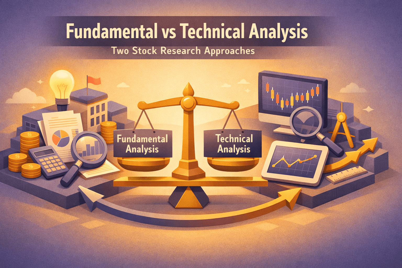
Q: Can chart reading replace fundamental research?
A: No, charts show price history and market behavior but they do not reveal underlying business health. Use charts with fundamental analysis to get a fuller picture of a company and its prospects.
Bottom Line
Reading stock charts gives you a visual language for price action. You'll learn to read axes, choose the right time frame, and use simple tools like moving averages and volume to spot meaningful trends.
Start small, practice on a few names such as $AAPL and $MSFT, and build a consistent routine. At the end of the day charts help you interpret what the market is doing, but they work best when combined with other research and a clear plan.