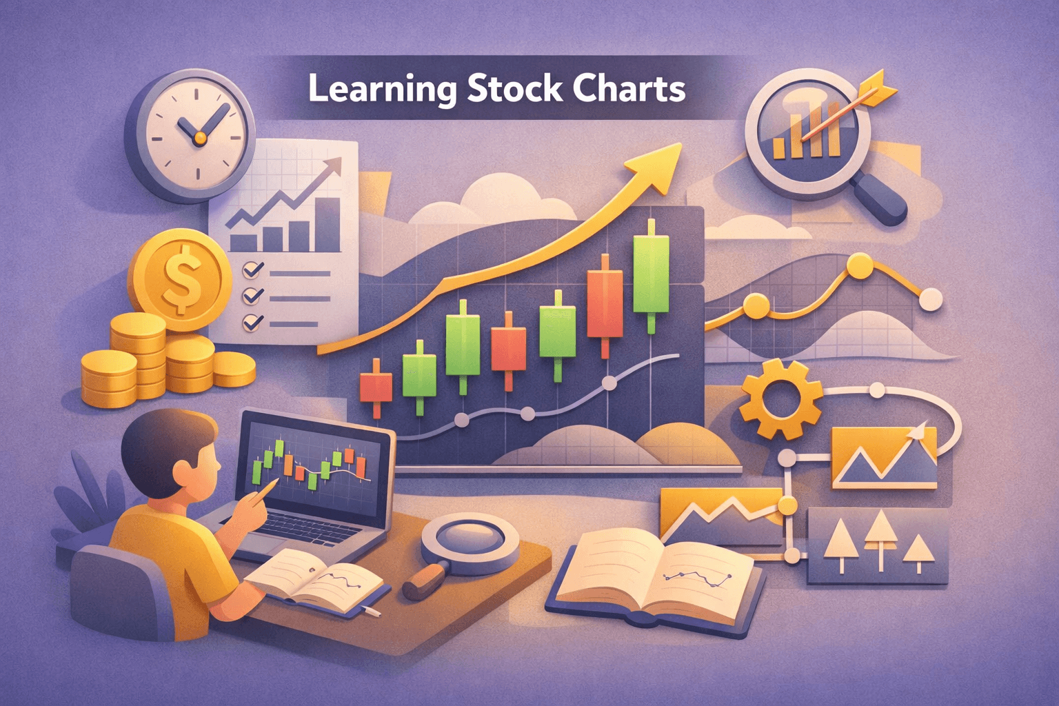
- Understand the core components of a stock chart: price axis, time axis, volume, and price plot.
- Different chart types, line, bar, and candlestick, show the same price data with different levels of detail.
- Trends are identified with higher highs/lows (uptrend) or lower highs/lows (downtrend); use moving averages to smooth noise.
- Support and resistance are price zones where supply or demand repeatedly appears; measure strength by tests and volume.
- Combine price action with volume, moving averages, and trendlines for higher-probability setups; avoid relying on a single indicator.
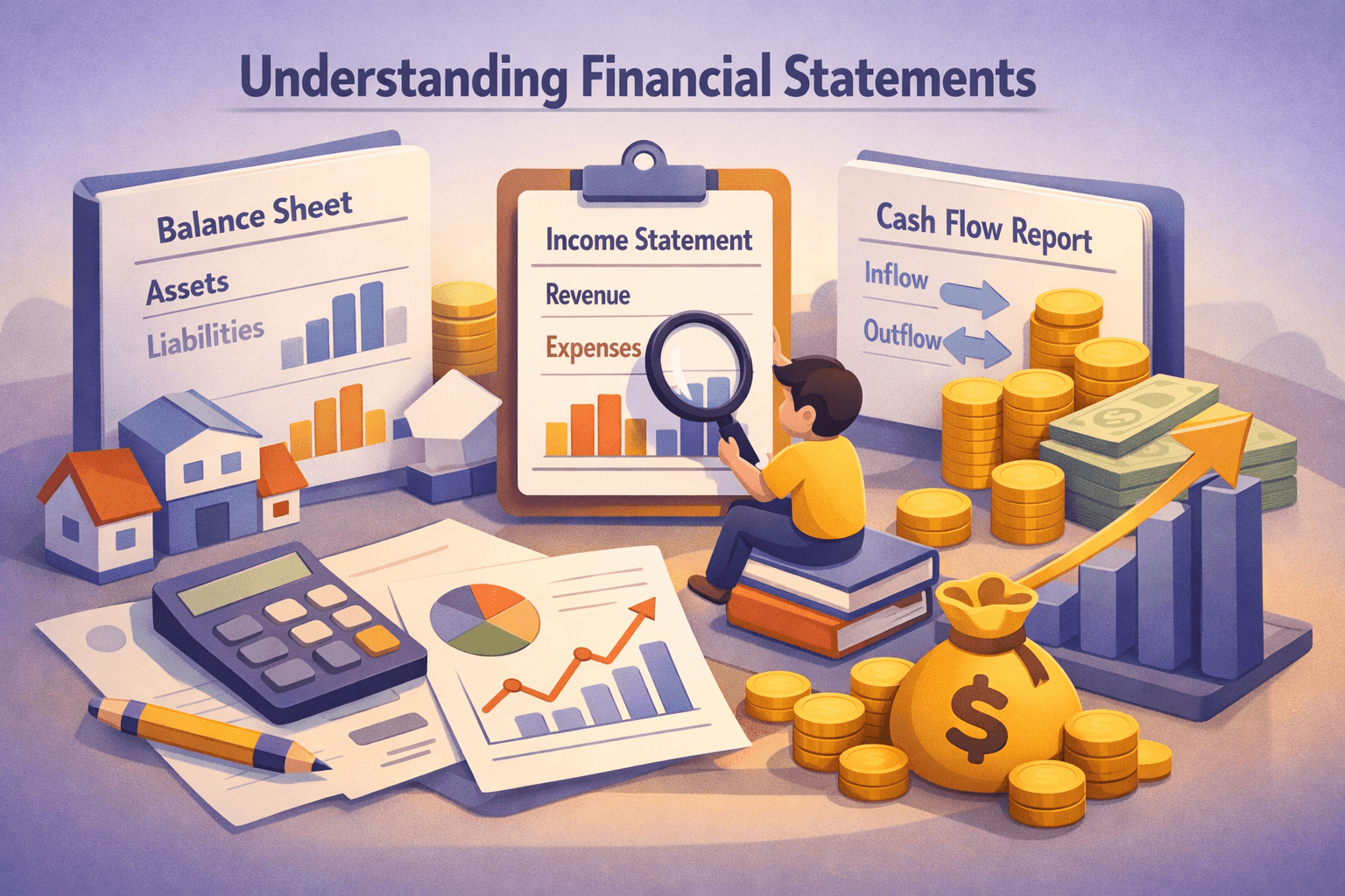
Introduction
Reading stock charts means translating price and volume history into a visual story you can use to make better trading or investing decisions. Charts condense complex market actions into patterns and numbers that reveal trend direction, momentum, and levels where buyers or sellers tend to appear.
This matters because disciplined chart reading helps you align with dominant market forces and manage risk. Investors who can spot trends, correctly mark support and resistance, and interpret candlestick patterns tend to make more objective decisions.
In this guide you'll learn chart components, how to read line, bar, and candlestick charts, techniques to identify trends and key levels, and practical examples using $AAPL and $NVDA. Expect hands-on steps you can apply on your charting platform.
1. Chart Basics: Components and What They Mean
Every stock chart displays price on the vertical axis and time on the horizontal axis. Volume is usually shown as a separate histogram at the bottom and provides context for price moves. Other common overlays are moving averages and trendlines.
Key elements to scan first:
- Timeframe: intraday (minutes), daily, weekly, choose the timeframe that matches your horizon.
- Price scale: linear vs. logarithmic, use log for multi-year moves to represent percentage changes evenly.
- Volume: confirms strength of moves, rising price with rising volume is more reliable than with falling volume.
How to read the axes and scales
The horizontal axis shows the sequence of prices; the vertical axis shows the price range. If you're comparing percentage moves across years, switch to a logarithmic scale so equal vertical spacing equals equal percentage moves.
On platforms, enable gridlines and adjust the price scale to avoid distorted visual impressions, very wide or narrow vertical ranges can hide meaningful patterns.
2. Chart Types: Line, Bar, and Candlestick
Chart types present the same price series differently. Learning each gives you flexibility: line charts for trend context, bar charts for price range detail, and candlesticks for quick visual reading of open/close relationships.
Line charts
Line charts connect a single price point per period, usually the close. They reduce noise and are ideal for identifying broad trends. For example, a daily line chart of $AAPL over two years will quickly show the long-term uptrend or a flat market phase.
Bar charts
Bar charts display the open, high, low, and close (OHLC) as a vertical line with ticks. They provide more detail than a line chart and are helpful when you want to evaluate intra-period volatility.
Candlestick charts
Candlesticks package the same OHLC data in a more visual way: a body shows the open-to-close range and wicks show extremes. Bullish candles (close > open) and bearish candles (close < open) are easy to spot, making candlesticks a favorite for many traders.
Example: a long upper wick after an up day can indicate selling pressure near the high, useful for spotting potential reversals.
3. Identifying Trends and Trendlines
Trend identification is the foundation of technical analysis. A simple rule: uptrends make higher highs and higher lows; downtrends make lower highs and lower lows.
Drawing and using trendlines
Draw a trendline by connecting at least two swing lows in an uptrend (or swing highs in a downtrend). The more touches without a breach, the more significant the trendline. For example, connecting three higher lows on a weekly $NVDA chart suggests a durable uptrend.
Use trendlines as dynamic support/resistance. If price falls through a long-standing trendline on strong volume, it may signal a trend change.
Moving averages for trend confirmation
Moving averages smooth price data and help you gauge trend direction and strength. Common settings: 50-day and 200-day simple moving averages (SMA) for medium and long-term trend context; 20-day EMA for shorter-term momentum.
Example: $AAPL trading above its 200-day SMA suggests long-term bullish bias. A 50-day crossing above the 200-day (a “golden cross”) is often interpreted as structural improvement, while the opposite is bearish.
4. Support and Resistance: Finding Price Zones, Not Exact Lines
Support and resistance are areas where price repeatedly stalls or reverses due to concentrated buying or selling. Think of them as zones rather than exact points, market orders cluster around ranges, not single ticks.
How to identify support and resistance
- Scan historical swings: previous reversal lows are support; previous highs are resistance.
- Look for volume clusters: high-volume nodes on a volume profile indicate levels where a lot of trading occurred and can act as support/resistance.
- Use moving averages and prior consolidation ranges to define zones.
Example: If $AMZN had multiple daily closes between $95 and $100 over several weeks, that range becomes a resistance zone until price decisively breaks out with follow-through volume.
Testing strength of levels
A level tested three or more times holds more weight. Also watch the volume on tests: a support tested with falling volume is likelier to hold than one tested with rising volume that indicates selling pressure.
After a breakout above resistance, the old resistance often becomes new support. A return to test that level on reduced volume is a common retest pattern used to validate the breakout.
5. Using Volume, Indicators, and Multiple Timeframes
Price without context can be misleading. Volume, momentum indicators, and comparing multiple timeframes provide a fuller picture and reduce false signals.
Volume as a confirmation tool
Rising price on rising volume is confirmation; rising price on falling volume is suspect. Example: $NVDA posts a 6% gap up but with below-average volume, this could be an initial spike that lacks institutional participation.
Momentum indicators
Indicators like RSI or MACD measure momentum and divergence. A bearish divergence, price making higher highs while RSI makes lower highs, can warn of an impending weakening in the uptrend.
Multiple timeframe analysis
Use higher timeframes to define the primary trend and lower timeframes to time entries. For instance, if the weekly chart of $AAPL is in an uptrend, use the daily chart to find a short-term pullback entry near support.
Real-World Example: Reading a Candlestick-Based Setup on $AAPL
Scenario: $AAPL has been in a weekly uptrend for nine months and trades at $160. The daily chart shows a pullback to $148, near the 50-day SMA at $150 and a prior consolidation zone between $147, $151.
Steps to analyze:
- Confirm trend: Weekly price above 200-week SMA, long-term bias bullish.
- Identify level: Daily support zone $147, $151 aligns with the 50-day SMA, multiple supports converge.
- Check volume: Pullback occurs on below-average volume, suggests lack of selling conviction.
- Candlestick signal: A bullish engulfing day on $148 with volume uptick hints at demand returning.
Interpretation: Confluence of higher timeframe trend, moving average support, and a volume-backed bullish candlestick improves the probability that the pullback may end. This is not a recommendation to buy; it's a framework for assessing the setup.
Common Mistakes to Avoid
- Overfitting patterns: Forcing charts to match a favorite pattern leads to biased decisions. Use objective rules and multiple confirmations.
- Ignoring volume: Treating price patterns without volume confirmation increases false positives. Check whether volume supports the move.
- Relying on a single indicator: No indicator works in isolation; combine trend, price action, and volume.
- Using the wrong timeframe: Making intraday trades based solely on weekly charts can miss timing and volatility; align timeframe to your trading horizon.
- Chasing breakouts without confirmation: Entering on the first spike above resistance without a retest or follow-through often leads to quick reversals.
FAQ
Q: How many candlestick patterns should I learn to be effective?
A: Focus on a handful of high-probability patterns, engulfing, hammer, shooting star, doji, and learn to read them in context with volume and trend. Pattern quantity is less important than contextual interpretation.
Q: Which moving averages are most useful for trend identification?
A: Commonly used are the 20-day EMA for short-term momentum, 50-day SMA for medium-term trend, and 200-day SMA for long-term trend. Use them together to see trend alignment across horizons.
Q: Can support and resistance be used for stop placement?
A: Yes, places stops beyond clear support/resistance zones reduce the chance of being stopped by normal price noise. Consider volatility and position size when setting the distance for stops.
Q: How do I avoid false breakouts?
A: Look for breakout confirmation: follow-through price action, rising volume, and successful retest of the breakout level. Multi-timeframe confirmation also lowers the risk of false signals.
Bottom Line
Reading stock charts is an essential skill that combines visual pattern recognition with objective measures like moving averages, volume, and multi-timeframe context. Start with clear rules for trend, support/resistance, and confirmation so you reduce emotional bias.
Action steps: choose a charting platform, practice identifying trends and levels on two or three tickers such as $AAPL and $NVDA, and record entries, outcomes, and lessons in a trade journal. Over time, building pattern recognition and a disciplined confirmation process will improve your chart reading and decision-making.
Continued learning, through replaying past charts, testing setups, and integrating indicators conservatively, turns chart reading into a reliable part of your analysis toolkit.